Overview
ProDev is built as an SPA and is a tool so the ui was given an admin style dashboard and navigation. Below are early images of the bare bones structure once the dashboard layout and functionality were developed.


At this stage the navigation is operational and the following is in place:
- Dashboard elements transition in on load
- Top nav contents change on different size devices
- Side-nav and top-bar elements transition in/out at the break point
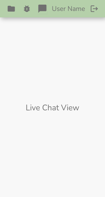
- The side-chat can be toggled in and and out from the right with a smooth transition
- On larger screens the side-chat component is taken out of the main router view but on smaller screens the chat component is added back so it takes up the full width and does not wrap below. This provides a more focused mobile app feel on smaller screens but allows full functionality above the break point.
To manage dark and light mode the Vue conditional class is used: :class="{light: light}", the default theme is dark mode.
Managing Breakpoints
The top-bar and side-nav are custom built using flexbox, custom breakpoint logic was put together to manage the responsive behaviour. The first snippet is to manage how the dashboard and content is loaded on login:
        const handleLogout = async () => {
            await logout()
            light.value = false
            showSideChat.value = false
            router.push({name: 'Login' })
        }
        const handleLogin = () => {
          showTopBar.value = false
          showTopBar.value = true
          if(window.innerWidth < 1100){
              showSideNav.value = false
              showSideChat.value = false
          }
          if(window.innerWidth > 1100 && user.value){
            showSideNav.value = true
          }
        }
This next snippet manages the responsive behaviour in differing situations and takes advantage of Vue lifecycle hooks:
        onBeforeMount(()=> {
            if(window.innerWidth < 1100){
              showSideNav.value = false
              showSideChat.value = false
            }
            if(window.innerWidth > 1100){
                showSideNav.value = true
            }
        })

        window.addEventListener('resize', () =>{
            if(window.innerWidth < 1100){
              showSideNav.value = false
              showSideChat.value = false
            }
            if(window.innerWidth > 1100 && user.value){
              showSideNav.value = true
              if(route.name == 'Chat'){
                router.push({ name: 'MyProjects' })
                showSideChat.value = true
              }
            }
        })

        onBeforeUpdate(() => {
          if(window.innerWidth < 1100){
              showSideNav.value = false
              showSideChat.value = false
            }
            if(window.innerWidth > 1100 && user.value){
              showSideNav.value = true
            }
        })

        onUnmounted(() => {
          window.removeEventListener()
        })
The boolean properties above are ref() reactive properties that have been defined outside of the code snippet. To access a ref's value the dot notation .value is used.
Before moving on there are some intricate bits to cover within the template structure regarding the navigation:
Router-View Transitions
            <router-view :light="light"
            @signedUp="handleLogin"
            @login="handleLogin"
            v-if="
            (!showSideChat && !showSideNav) ||
            (!showSideChat && showSideNav) ||
            (showSideNav)"
            v-slot="{ Component }">
              <transition name="route" mode="out-in">
                <component :is="Component"></component>
              </transition>
            </router-view>
Above we are looking at the <router-view> normally the opening tag is also the closing tag but when transitions are used between views this is the pattern to use with Vue 3.
A v-slot is added to the router-view grabbing the current view via Component, inside that are the transition tags using the mode="out-in" and inside them the <component> tag is binding to the Component signifying whichever component the router-view is mounting at the time.
Now which ever transitions are assigned to route will be executed for each view.
Element Transitions
There are transition tags around both the top-bar and side-nav for on load transitions. These are using the JS hooks in conjunction with GSAP. The below image shows the side-nav with the transition tags and JS hooks:
<div class="row main-row" :class="{light: light}">
    <transition name="side-nav" appear
    @before-enter="sideNavBeforeEnter"
    @enter="sideNavEnter"
    @before-leave="sideNavBeforeLeave"
    @leave="sideNavLeave">
    <div class="col-2 side-nav" v-if="showSideNav && user" :class="{light: light}">
        <nav :class="{light: light}">
        <div class="logo" :class="{light: light}">
        <router-link :to="{ name: 'MyProjects' }" :class="{light: light}"><h3 :class="{light: light}">ProDev</h3></router-link>
        </div>
        <div class="nav-spacer">
        </div>
        <ul class="navbar-nav mb-2 mb-lg-0">
            <li class="nav-item" @click="toggleSideChat" :class="{light: light}">
                <span :class="{light: light}" class="chat-side-nav">Team Chat</span>
            </li>
            <li class="nav-item" :class="{light: light}">
                <router-link :to="{ name: 'TeamProjects' }" :class="{light: light}" class="projects">Team Projects</router-link>
            </li>
            <li class="nav-item" :class="{light: light}">
                <router-link :to="{ name: 'MyProjects' }" :class="{light: light}" class="projects">My Projects</router-link>
            </li>
            <li class="nav-item" :class="{light: light}">
                <router-link :to="{ name: 'NewProject' }" :class="{light: light}" class="projects">New Project</router-link>
            </li>
            <li class="nav-item" :class="{light: light}">
                <router-link :to="{ name: 'Bugs' }" :class="{light: light}" class="bugs">Bugs</router-link>
            </li>
            <li class="nav-item" :class="{light: light}">
                <router-link :to="{ name: 'NewBug' }" :class="{light: light}" class="bugs">New Bug</router-link>
            </li>
            <li class="nav-item" :class="{light: light}">
                <router-link :to="{ name: 'ReportIssue' }" :class="{light: light}" class="util">Report Issue</router-link>
            </li>
        </ul>
        </nav>
        <div class="dark-mode" :class="{light: light}">
            <div  class="nav-item" :class="{light: light}" @click="toggleMode">
            <span :class="{light: light}" class="util">Mode</span>
            </div>
        </div>
    </div>
    </transition>
    <div class="col main-col" :class="{ light: light }">
Note that the <router-link> inside the <li> tags does not have <a> tags. Vue adds these to the HTML.
Here is the logic using GSAP for the side-nav transition:
const sideNavBeforeEnter = (el) => {
    el.style.transform = 'translateX(-400px)'
    el.style.opacity = 0
}

const sideNavEnter = (el) => {
    gsap.to(el, {
    x:0,
    opacity: 1,
    duration: 0.6,
    ease: 'sine',
    })
}

const sideNavBeforeLeave = (el) => {
    el.style.transform = 'translateX(0)'
    el.style.opacity = 1
}

const sideNavLeave = (el) => {
    gsap.to(el, {
    x:-400,
    opacity: 0,
    duration: 0.3,
    ease: 'sine',
    })
}